UI/UX for “Hacker”, an earlier iteration of Domain, a location-based mobile game created by a team of students at the University of Southern California.

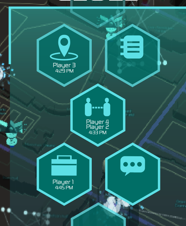
Final concepts for what my UI assets could look like in-game
This project was my first foray into UI/UX on a group project where I learned a lot about the way graphic design intersects with interactive design when it comes to mobile games. I primarily used Adobe Illustrator to create these mockups, and worked alongside good friend and fellow team member Spencer Divis as well as another member of the team who worked more specifically on UX. The original concept for Hacker was a social stealth/faction conflict game in the vein of Mafia, Ingress, or Among Us with opposing teams, hidden identities, and location-based tasks on a procedurally generated map based on real surroundings, set in a future where some people live completely in a beautiful AR world that covers up the unpleasant truths of ecological collapse and post-apocalyptic woes, and one faction fights to preserve the illusion while another wants to show people the truth. This was an intriguing concept but the game moved in another direction after playtests showed it wasn’t as fun and user-friendly to play as hoped. In addition to being on the UI/UX team, I was a writer and concept artist and worked closely with game director Catherine Chen.

Rough, early concepts for the feel of a loading screen or title screen. The last/third one is my favorite! If I were bringing this to full fruition today, I would take the last one, refine the assets a lot more, ditch hand-drawn-looking strokes, put in a game logo that was more on-brand and typographically in line with the other fonts, change the color scheme to be more in line with the rest of my UI, and have a lot more dark indigo space.

Revision pass (right side) on some vending machine concept art (left side) by Knox Ciel Lopez to bring it more in line with what game director Catherine Chen and I had in mind for the feel, color design, and shape language of the game world. We were going for something lineless and geometric with polygonal shapes, vibrant colors, and higher contrast.

Inventory menu featuring multiple pages of hexagonal item slots that can be scrolled through horizontally, player info, and in-game currency balance.

Later, more concise iteration of main screen with “intel” and “clue” mechanics.

Concept for the in-game chat screen.

Concept for the content of items in the “clue” bin, earned through game activities to help aid a player in identifying what faction each player is working for.

Concept for a scrollable activity log screen with activity type filters and placeholder emoji reacts.

Screen for when a player taps on an inventory item and can choose to use it or give it to another player.